


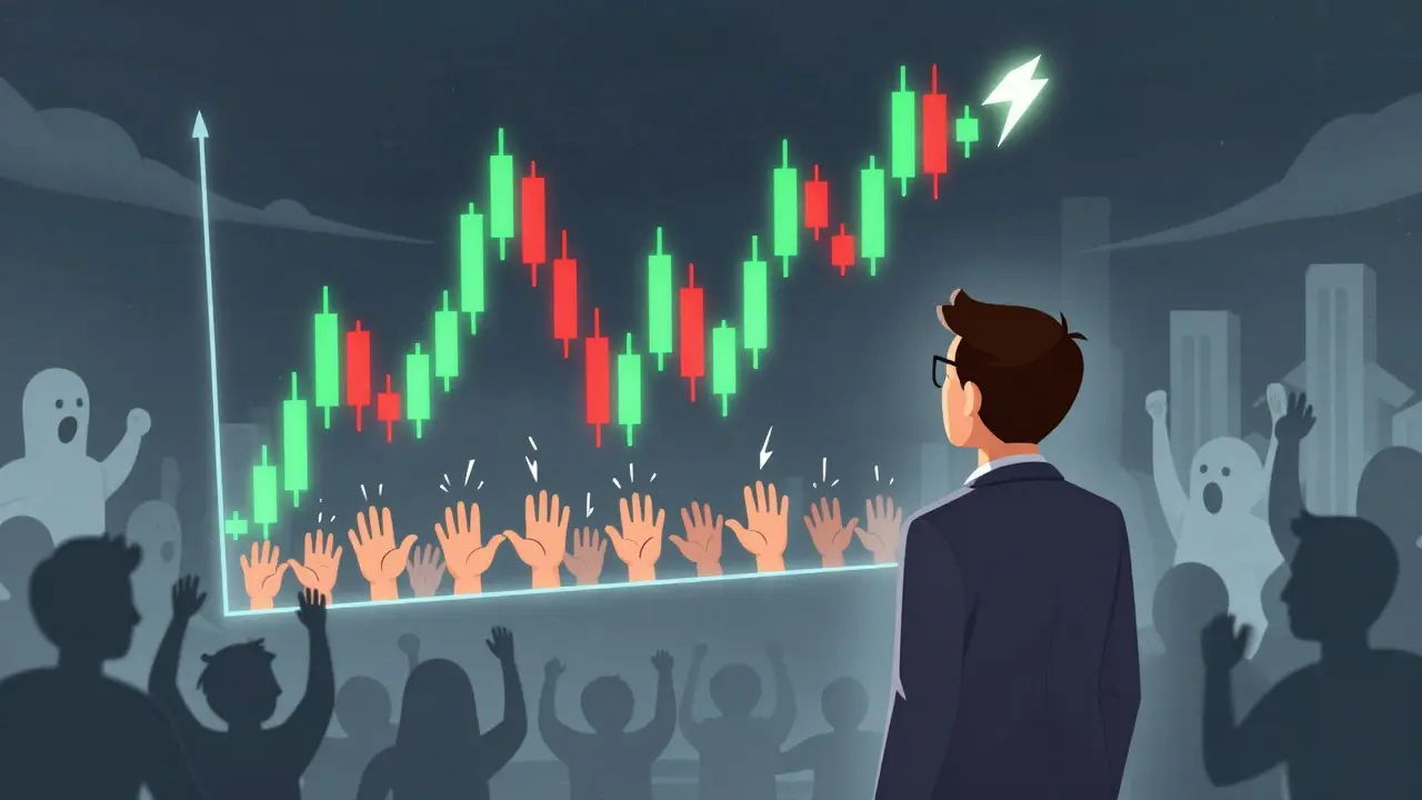
Spot price charts aren’t just lines on a screen-they’re a window into what thousands of traders are thinking right now. Whether you’re watching Bitcoin, Ethereum, or any other asset, the price movement you see is the collective result of fear, greed, hesitation, and conviction. Learning to read these charts isn’t about predicting the future. It’s about understanding what’s already happening in the market and making smarter decisions based on real price behavior.
What Spot Price Charts Actually Show
At their core, spot price charts track the price of an asset over time. But they don’t just show one number-they show four key pieces of information for every time period: the open, high, low, and close (OHLC). These aren’t abstract numbers. They tell a story.
Imagine Bitcoin trading over a 1-hour period. It opens at $62,000, spikes to $62,800, drops to $61,900, then closes at $62,500. That’s not random noise. The open tells you where buyers and sellers started the hour. The high shows where buyers pushed hardest. The low reveals where sellers took control. And the close? That’s the final verdict-did buyers win, or did sellers take over by the end?
These four points form the foundation of every chart type you’ll encounter. Without understanding OHLC, you’re just looking at shapes without knowing what they mean.
The Three Main Types of Charts
Not all charts are created equal. There are three main types, each with strengths and weaknesses depending on your trading style.
- Line charts connect only the closing prices. Simple. Clean. Great for spotting long-term trends. If you’re holding Bitcoin for months and want to see if it’s generally going up or down, this is your go-to. But they hide everything that happened in between-volatility, spikes, reversals. You won’t see the full picture.
- Bar charts show all four OHLC values. Each bar is a vertical line with two small horizontal ticks. The top of the line is the high, the bottom is the low. The left tick is the open, the right tick is the close. These are compact and packed with data. Professional traders in futures markets use them because they’re efficient. But they lack visual impact. You have to squint to tell if the price went up or down.
- Candlestick charts are the most popular-used by 78% of active traders according to NewTrading.io’s 2023 survey. Each candle has a body and wicks. The body shows the open-to-close range. If the close is higher than the open, the body is green (or white). If it’s lower, it’s red (or black). The wicks (or shadows) extend above and below the body to show the high and low. This format makes it easy to see momentum at a glance. A long green body? Strong buying pressure. A long upper wick? Buyers pushed up but got rejected. A tiny body with long wicks? Indecision.
For cryptocurrency traders, candlesticks are the default. Why? Because crypto moves fast. You need instant visual cues. A red candle closing below the previous one’s low? That’s a signal. A green candle engulfing the prior red one? That’s a potential reversal. You don’t need to count ticks-you feel the momentum.
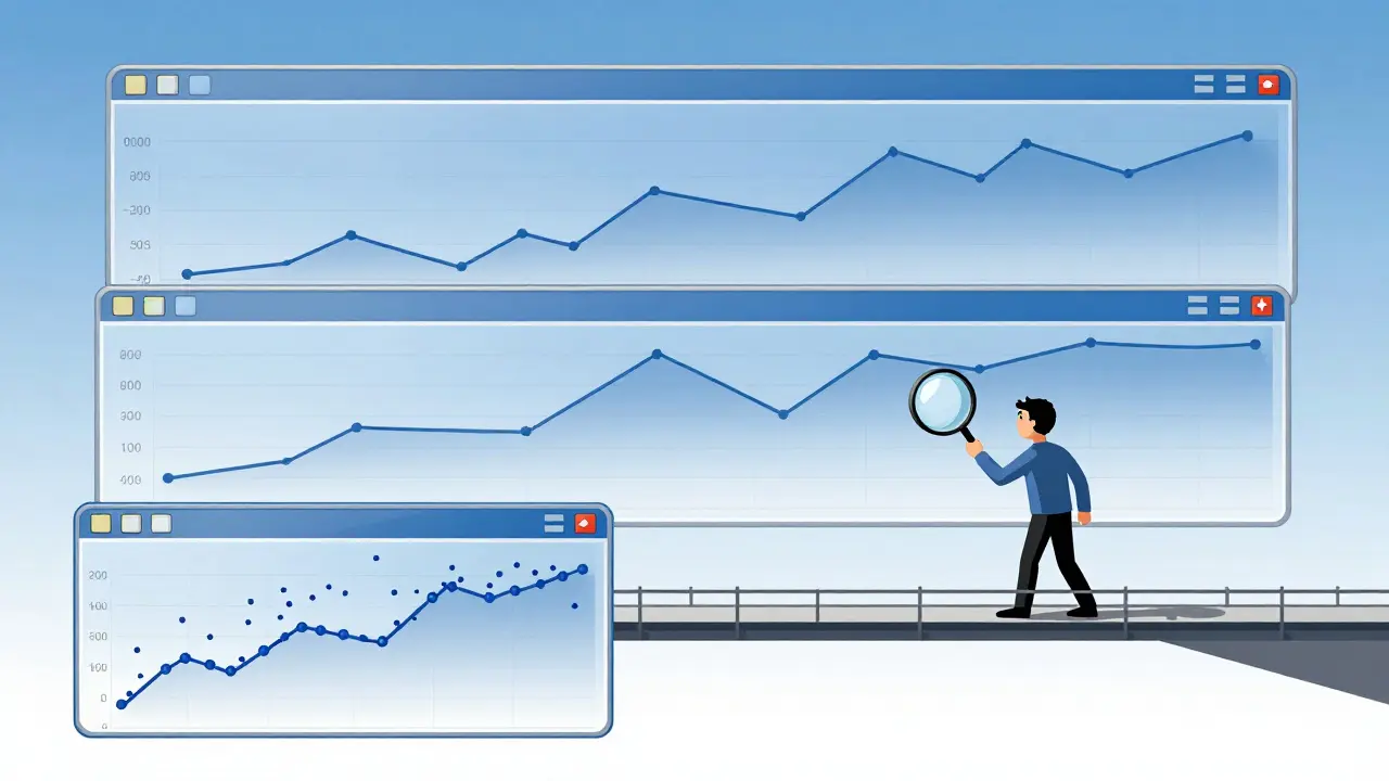
Timeframes Matter More Than You Think
There’s no single ‘right’ timeframe. Your chart depends on your strategy.
- 1-minute to 1-hour charts are for day traders. These are noisy. You’ll see dozens of patterns in a single day. Many fail. But if you’re trading small positions and reacting to news, this is where you live.
- 4-hour and daily charts are where most serious traders focus. This is the sweet spot. You see real trends, not random noise. 68% of daily crypto trades happen on these intervals, according to Africa Exchange’s 2023 data.
- Weekly and monthly charts are for investors. If you’re holding Bitcoin for a year or more, these show the real story. A breakout on a weekly chart carries more weight than one on a 15-minute chart.
Here’s what works: use multiple timeframes. Look at the weekly chart to know the trend. Then switch to the 4-hour to find where the pullback might end. Finally, use the 15-minute chart to time your entry. This is how professionals filter out false signals.
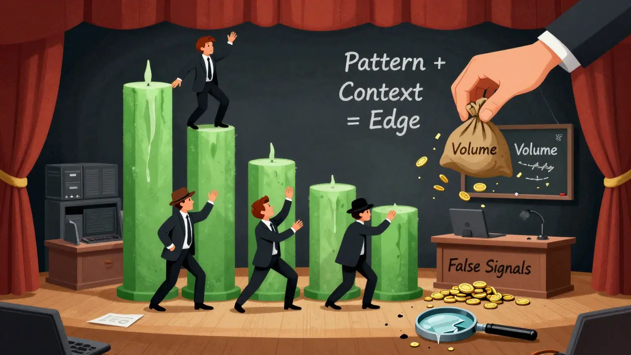
Patterns Aren’t Magic-They’re Psychology
Head and shoulders. Double tops. Cup and handle. These names sound like fairy tales. But they’re not. They’re repeated patterns caused by human behavior.
A head and shoulders pattern forms when buyers push price up three times. The middle peak (the head) is the highest. The two smaller peaks on either side (the shoulders) are weaker. When price breaks below the neckline (the support line connecting the two troughs), it signals sellers have taken control. According to Dr. Andrew Aziz’s 2023 research, these patterns succeed 73.5% of the time when volume increases on the breakdown.
Double tops? They happen when price hits a resistance level twice and fails both times. The second failure, especially if volume drops, tells you the buyers are exhausted. Fidelity’s 2022 institutional data shows triple-top patterns lead to profitable short positions 82% of the time-if the third peak doesn’t even beat the prior highs by more than 0.3%.
But here’s the catch: patterns only work when they’re confirmed. A cup-with-handle pattern on a chart means nothing if the market is crashing because of a regulatory crackdown. In March 2023, hundreds of traders lost money on perfect cup-and-handle setups during the Silicon Valley Bank collapse. The chart looked right-but the context was wrong.
Volume Is Your Secret Weapon
Price tells you what happened. Volume tells you how many people cared.
A breakout on low volume? Probably fake. A breakout on high volume? That’s real conviction. TradingView’s 2022 backtest showed candlestick patterns generate 22% more false signals in markets with under 500,000 average daily volume. That’s why Bitcoin and Ethereum patterns are more reliable than low-cap altcoins.
Look for volume spikes. If price breaks above resistance and volume surges 150% above the 30-day average, that’s a strong signal. Investopedia’s 2023 case study tracked trader Mark Douglas, who made 23 straight winning trades using descending triangle patterns-each confirmed by volume spikes. He didn’t just draw lines. He waited for the crowd to show up.
Conversely, if price rises but volume declines, it’s a warning. Buyers are losing steam. This is called divergence. It’s one of the most reliable early signals of a reversal.
Support and Resistance Are Real-But Only If They’re Tested
Support is a price level where buyers step in. Resistance is where sellers step in. Simple. But most beginners misidentify them.
A valid support level isn’t just a line you draw where price bounced once. It needs to be tested at least twice. Africa Exchange’s 2023 guide says the bounce should be at least 1.5% off the level. One bounce? Coincidence. Two or three? That’s a zone.
Same with resistance. It’s not a single high. It’s a cluster of failed attempts within 2% of each other. The more times price hits that level and reverses, the stronger it becomes.
When price finally breaks through resistance with volume, it often becomes new support. And when it breaks below support, that level often becomes resistance. This flip is called role reversal. It’s a fundamental principle you’ll see over and over.
Why Most People Fail at Reading Charts
It’s not because they’re bad at math. It’s because they skip the basics.
63% of beginner errors come from mixing timeframes. Someone sees a bullish candle on a 5-minute chart and assumes the daily trend is up. They buy. Then the daily chart drops 8% the next day. They’re confused. But the answer was simple: they ignored the bigger picture.
Another big mistake: chasing every pattern. Not every head and shoulders, not every engulfing candle, is worth trading. You need confirmation. Volume. Context. Trend alignment. A pattern on a daily chart with rising volume and price above the 200-day moving average? That’s high-probability. A pattern on a 1-minute chart during low volume? That’s gambling.
And then there’s overconfidence. Reddit’s r/Daytrading community has thousands of success stories. But also hundreds of posts saying, “I saw a perfect pattern and lost everything.” The difference? The winners waited. The losers acted.
What’s Changing in Chart Analysis
Tools are getting smarter. TradingView’s PatternAI, launched in May 2023, scans 15 million historical patterns and gives you a probability score. It doesn’t tell you what to trade. It tells you how likely a pattern is to work based on past performance.
Institutional traders are using machine learning to validate traditional patterns. Head-and-shoulders patterns, for example, have a 68.4% historical success rate-now algorithms are filtering out the ones that happen in choppy markets.
Fidelity’s ‘Pattern Matrix’ tool, released in September 2023, doesn’t just identify patterns. It calculates dynamic price targets based on volatility and market conditions. A double top in a high-volatility environment gets a different target than one in a calm market.
And for crypto? The future is combining chart patterns with on-chain data. Glassnode’s roadmap includes linking candlestick patterns to exchange netflow-seeing if coins are moving to or away from exchanges. A bullish engulfing candle on Binance, paired with a drop in exchange holdings? That’s a powerful combo.
How to Start Learning
You don’t need a finance degree. You need practice.
Babson College’s 2022 study found traders need 87 hours of deliberate practice to reliably identify patterns with 70% accuracy. Break it down:
- Recognition (21 hours): Learn to spot the basic patterns-candlestick types, support/resistance, triangles, head and shoulders. Use free charting tools like TradingView.
- Confirmation (34 hours): Add volume. Add moving averages. Add trendlines. Don’t trade a pattern unless it has at least two confirmations.
- Execution (32 hours): Write down your rules. When do you enter? Where’s your stop? Where’s your target? Stick to them.
Start small. Watch one asset. One timeframe. One pattern. Master that. Then expand.
And remember: charts don’t guarantee profits. They give you an edge. The edge comes from discipline, not prediction.
What’s the difference between spot price charts and futures charts?
Spot price charts show the actual current market price of an asset like Bitcoin or Ethereum. Futures charts show contracts that promise to buy or sell at a future date. Futures prices can be higher or lower than spot due to leverage, interest, and market expectations. Spot charts reflect real ownership; futures charts reflect bets on future price. Most beginners should start with spot charts because they’re simpler and don’t involve leverage risk.
Can I use spot price charts for crypto trading?
Yes, absolutely. In fact, spot charts are the most common tool for crypto traders. Platforms like Binance, Kraken, and Coinbase all display candlestick charts for spot trading. Since crypto markets are open 24/7, spot charts give you real-time insight into buying and selling pressure without the complexity of futures contracts. Most successful crypto traders rely on spot charts combined with volume and on-chain data.
Why do some people say technical analysis doesn’t work?
Critics like Nobel laureate Eugene Fama argue that markets are efficient and past price data can’t predict future moves. But behavioral finance has changed that view. Studies from Yale and the University of Chicago show that chart patterns capture real human biases-like fear of missing out or panic selling-that create temporary inefficiencies. Technical analysis doesn’t predict the future with 100% accuracy. It identifies high-probability setups based on how crowds behave. That’s why 86% of institutional traders still use it.
How do I avoid false signals on spot charts?
Never trade a pattern on its own. Always wait for confirmation. Use volume: a breakout needs higher-than-average volume. Use trend: don’t buy a bullish pattern in a strong downtrend. Use timeframes: check the daily chart before acting on a 1-hour signal. And avoid low-volume assets-false breakouts are common there. The most reliable signals combine pattern recognition with volume, trend, and context.
What’s the best charting platform for beginners?
TradingView is the best starting point. It’s free, easy to use, and shows candlestick charts, volume, and indicators like moving averages. It’s used by over 30 million people and integrates with most major exchanges. You can practice drawing support/resistance, spotting patterns, and testing ideas without risking money. Once you’re comfortable, you can move to platforms like Thinkorswim or MetaStock for advanced tools.


People Comments
Man, I used to think charts were magic spells until I realized they're just a mirror of human panic and greed. Now I just watch for the big green candles after a dump - that’s when the real money moves. No fancy indicators, just vibes and volume. Trust the crowd, not the gurus.
Really liked how you broke down OHLC - most people skip that and just chase patterns. I’ve been using the 4-hour + weekly combo for months now and it’s cut my losses by half. The key is waiting for the close, not reacting to intra-candle noise. Also, volume confirmation is non-negotiable. If it’s not on high volume, it’s just noise.
lol technical analysis is just astrology with more charts and less stars. you think a head and shoulders means something but the real reason btc dropped was because some hedge fund in bermuda dumped 20k coins on binance at 3am and nobody noticed until it was too late. patterns dont work when the market is controlled by whales with bots smarter than your grandma's toaster
Don’t get me wrong, I love candlesticks - they’re pretty. But let’s be real: 90% of the time, I’m just looking at them while sipping coffee and wondering if I should’ve bought yesterday. I mean, sure, the pattern looks good… but is it *actually* good? Or am I just seeing what I want to see?
So you’re telling me all these traders are just reading tea leaves… but the tea leaves are made of blockchain data and they’re on caffeine? Cool. I’ll stick to HODLing and pretending I didn’t see that 30% dip.
Let’s not pretend this isn’t all a rigged game. The ‘patterns’ you’re talking about? They’re bait. The Fed, the exchanges, the whales - they all know when retail traders will react to a double top. They create the setups just to trigger stop-losses. You think you’re reading the market? You’re just another data point in their algorithm.
Charts are like dreams - they reflect your inner state more than reality. If you’re scared, you see bearish patterns. If you’re hopeful, you see bullish engulfing candles. The real skill isn’t reading the chart - it’s reading yourself. Are you trading because you see a pattern… or because you need to feel in control? That’s the real edge.
Y’all are overcomplicating this. Start small. Watch one coin. One timeframe. One pattern. Do it for 30 days. No trades. Just observe. Then, when you see the same thing happen again - and again - you’ll feel it. It’s not math. It’s muscle memory. And when you finally get it? You’ll know. Trust me, I’ve been there. You got this.
TradingView is fine for beginners, but don’t fall for the trap of thinking more indicators = better. I’ve seen people stack 12 oscillators on one chart and still lose money. The best traders use three things: price, volume, and time. Everything else is decoration. If you can’t explain your edge in 10 seconds, you don’t have one.
Great breakdown. One correction: when you say 'a breakout on low volume is probably fake,' it's not just 'probably' - it's statistically false. TradingView's own data shows that 89% of low-volume breakouts reverse within 24 hours. Always verify with volume. Always. No exceptions.
USA made the best charts. China uses AI to manipulate them. Europe overthinks them. And you people still believe in candlesticks like they’re holy scripture? Wake up. The market is a weapon. You’re just holding a spoon.
While I appreciate the pedagogical structure of your exposition, I must respectfully contend that the foundational premise of technical analysis remains epistemologically unsound. The efficient market hypothesis, as articulated by Fama and further corroborated by the work of Mandelbrot, suggests that price series exhibit fractal properties that render historical patterns statistically non-predictive. One is, therefore, engaging in a form of apophenia - perceiving meaningful patterns in stochastic noise - when one ascribes causal significance to candlestick configurations.
I used to think I needed to master every pattern, every indicator, every timeframe. Then I started journaling my trades - not just the entry and exit, but how I felt before and after. Turns out, the best trades were the ones I didn’t force. The ones where I waited, watched, and only moved when the market whispered, not screamed. Charts don’t tell you what to do. They show you where the crowd is. The real skill is knowing when to stand still.